Choosing Interior Design Color Combinations
There is nothing quite as exciting as getting together color cards and fabric swatches to decide what interior design color combinations work within the home. Some color combinations are surprisingly effective and have the ability to add joy and perspective to the atmosphere.
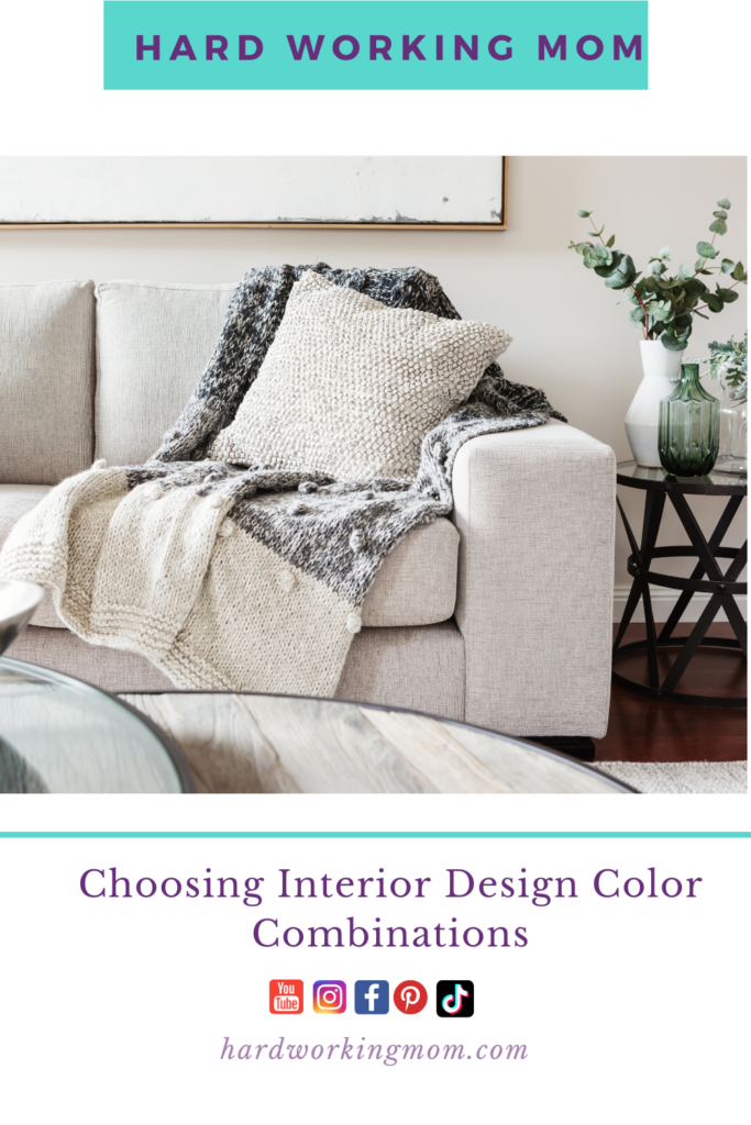
Choosing Interior Design Color Combinations
Going through the basics of interior design, this article will walk you through how to decide on the color schemes for each area of your home. We’ll also discuss how to blend colors with other schemes throughout the house. The overall goal is to make your house look well planned and professionally designed.
Gathering Information
If you pass by a paint store, take the opportunity to get some color cards. Many manufacturers differ, although sticking to good quality paints is a must. Here, if the shades available in cheaper paints are nicer, never forget that you can mix colors with better quality paints and take the color card to help you with your color choices.
The next stop would be a material supplier. Here, if you visit with color cards and have a basic idea of the color scheme you are keen on, you can ask for different swatches of material. These can be combined to make up a design board for the rooms of your home to see how the different color schemes work together. The larger the choice, the better the options.
Deciding The Main Color Scheme Tones
Interestingly, different colors give different impressions. Take a stack of color cards and open them, and the eye will be drawn towards different shades for different reasons. When creating a color scheme, this needs to be narrowed down to what is acceptable to the eye and gives a calming effect.
Natural tones are very good because these can be blended to make different complimenting colors. Blues can be cold, though warmed up to a gray, and they can add depth to a room. Yellows and the whole range within the spectrum of yellow/orange are warm and inviting colors. Whites are barren and cold on their own and can give you a nice starting point to building something creative.
Comparing Fabrics And Soft Furnishing Combinations
Here, it is important that the color scheme chosen blends or contrasts with items like sofas, curtains, and rugs. Of course, if the main combination is a pale one, this can be dressed up with richer colors in accents using such things as cushions, ornaments, etc. This will give depth and richness to the room. Look at the color swatches of material and work them over the color cards to see which combination works well. In the case of a sofa, you will have to imagine the combination of actually comparing the color card with the existing furnishings.
Choosing fabrics to blend and look great with your color choices is fun, and there are so many styles of curtains that the choice doesn’t stop there.
Deciding Which Effects Work Best
Having chosen the main color scheme, you need to decide whether the walls should have texture or not. This can be provided by textured wallpapers painted in your chosen color. Look at the whole home and the transition from one room to another, as many colors make up the spectrum that has to look blended with thought.
Opening the door to another room shouldn’t create a shock of change. By using different tones of the same color scheme, the eye is drawn to the overall picture of the home. Texture can also be applied before painting, though one thing to beware of is that texture encourages dust.
Other effects work well. For example, in a room that is too tall, creating a dado at the chair back height and painting the lower half darker than the upper half will create an illusion of the room being lower and less cold.
Trimming, Architraves, And Baseboards
While some prefer classic white, others prefer wood finishes. You can be experimental by drawing on your design board baseboards in different colors to see how they enhance the look. If sticking to white, sometimes ivory is more classical than a stark white. By trying out the ideas in crayons, you can see whether different color combinations work well for you.
Choosing Paints
When buying paints of your chosen color, opt for quality rather than cheapness. Mat finishes are much more attractive and non-reflective than satin finishes. They give a great look, and if the exact color you want to achieve is not available, buy small tubes of coloring to add to the colors bought. Black is a very useful coloring since it takes away the depth of other colors like green and blue, fading them into a more neutral color with its graying effect.
Choosing color combinations for the home is great fun, and just by adding a little white or a little black, the tone of colors can be transformed but still keep the combination a clear one. The different tones available in most good quality paints will amaze you. When you look back at your design board and then at the finished color combination, you will realize that the little bit of research and thought did pay off, giving you home with a color combination that works.
Final Thoughts
When tackling a do-it-yourself interior design project, keep these ideas and suggestions in mind. They will save you lots of time and money all while making the process pleasant. Are you redoing or upscaling part of your home soon? Share some of your ideas and thoughts in the comments below!